Aug 30, 2021
.jpg)
Have you ever just felt the vibe, good or bad, of a color when you saw it? You’re not alone! The way people experience color might differ from person to person, but there is an opportunity to elicit visual and emotional impact when choosing colors for your brand. Brands use color selection to their advantage as a way to stand out and be remembered. It also can set the stage for the experience of their audience. The science behind this is called color psychology and it is used to influence the way people see and experience a brand through color.
Color psychology is the study of the interaction of human experience and color. For example, when you see the color yellow, you may feel a spark of youthfulness or even a wave of optimism. The color red might make you feel passionate; which may be why Target picked red as their primary color. Another brand that strategically selected their brand color is Whole Foods which is branded in green, a color associated with health. These brands didn’t just pick colors based on favorites. They picked colors that not only looked good but resonated a particular feeling or message with customers. So before picking colors for your brand, you might want to take a second and ask yourself what your brand or business is offering and how you want your followers or customers to feel when they think about your brand.
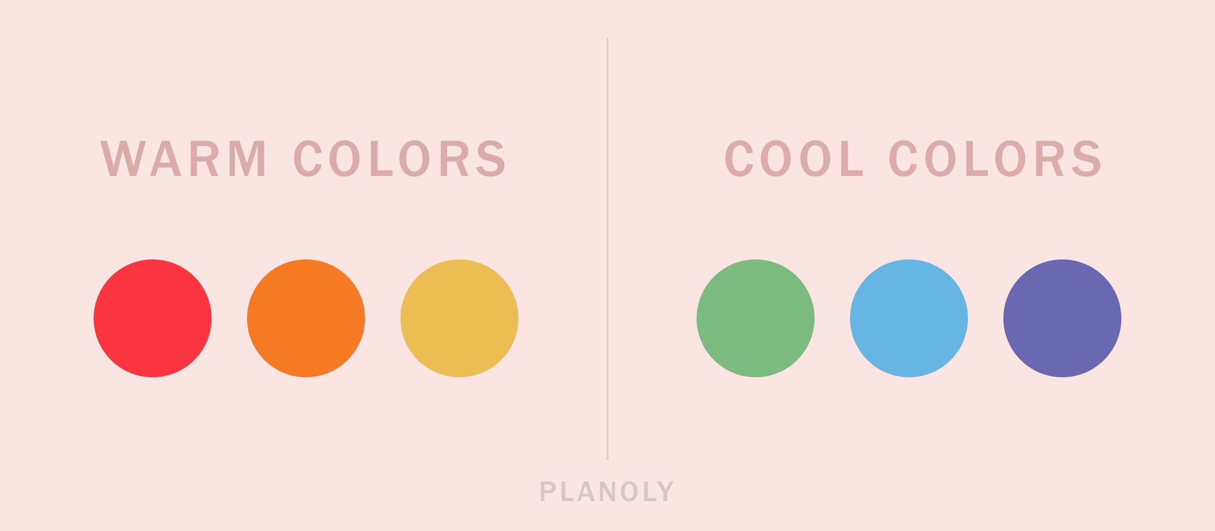
Did you know that there is actually a reason why most fast-food restaurants use warm colors in their branding? Warm colors are bright and energetic. They keep people moving. They want their customers in and out and coming back time and time again. These warm tones can also evoke an appetite, while cool colors, such as blue, aren’t as appetizing. Does anyone remember when Heinz came out with purple and green ketchup? It flopped. Why? People couldn’t stomach it! So while they may not have their place in fast food, cool colors do work well in other industries. Cool colors are typically calming and create a feeling of trust, making you want to stay for a while. Prime examples are Facebook and Twitter which are known for their blues. This is an example of even if a certain color looks cool to you, does it make sense for you and your brand? For example, a wellness/ spa brand wouldn’t use super loud or bright colors because the idea is to promote serenity or calmness so lighter colors would work better in the situation.
Check out our post on color theory for designers.
Some brands stick to black or white for their logo, keeping it clean and classic, luxurious and sophisticated. Another reason for this elegant color selection is to let other parts of the brand shine. In fact, here at PLANOLY, we only ever use our logomark in either black or white in varying opacities for this reason. Another brand you may recognize that showcases black for its logo is The New York Times. The color selection works well for a brand that started as a printed newspaper.
Sometimes, specific colors make sense for the type of product or service a brand provides, but it may cause the brand to blend in and get lost in a sea of other brands utilizing the same colors. Take a look around and do some visual research when choosing colors for your brand. One brand that took a risk but helped them stick out was Lyft. When you think of getting a lift somewhere, vibrant pink isn’t the first color many may have in mind, but their brand pink is such a memorable one and works well for them.
Not all brands have single-color logos so don’t limit yourself if you are in the process of building a color palette for your brand. There are endless options and this can become a daunting task. So, how do you go about matching these colors and keeping the essence of your brand? A great color palette tool to play around with while searching is Adobe’s Adobe Color website. You can find inspiration from different users on the platform or experiment with their color wheel. Our design team has also compiled their favorite color palette tools in an Instagram post:
At the end of the day, picking colors for your brand shouldn’t make you feel blue unless that’s the feeling you are hoping to send out into the world. Just remember to keep in mind your audience and how you’d like them to experience your brand. Your thoughtfulness in the process will be seen in the outcome. If you enjoy learning about color and brands and want to dive in more, be sure to check out our PLANOLY Presents Approachable Design workshop on Color Conversation with Zipeng Zhu.
.svg)
Enjoyed reading it? Spread the word


.jpg)


