May 21, 2021
.jpg)
We previously talked about how to create a cohesive feed on Instagram in this blog post, but we wanted to further expand on this topic. Having a consistent "look" to your grid will go a long way in your overall brand image on Instagram. Read on to learn more ways that you can curate your own color story for your grid! We are going to take you through the benefits of a color story and how you can get to making one all by yourself!
A color story is essentially a collection of images/videos that consist of a specific color palette. These images utilize color as a visual tool to create a connection between all of the images and videos within the collection.
In this day and age, our Instagram feeds are undoubtedly an extension of ourselves. Utilizing a color story helps create a visual experience that is not only aesthetically pleasing, but personal to you, which in turn communicates who you are to your audience and followers. Having a color story for your feed can also save you time in the long run, as you will find yourself editing all of your images in the same manner.

First, you'll want to establish your theme and mood. To do this, you'll want to do a bit of research. We've whipped up a few questions for you to answer to help get the ball rolling.
Next, we recommend that you create a Pinterest board to serve as your mood board for research. Within this board, pin images that utilize colors that you love, or that have an overall esthetic that you're drawn to. This board will simply serve as inspiration for your feed; you can reference it whenever you please, and it's a great way to visually gather inspiration. You can also create your own physical mood board if you prefer.

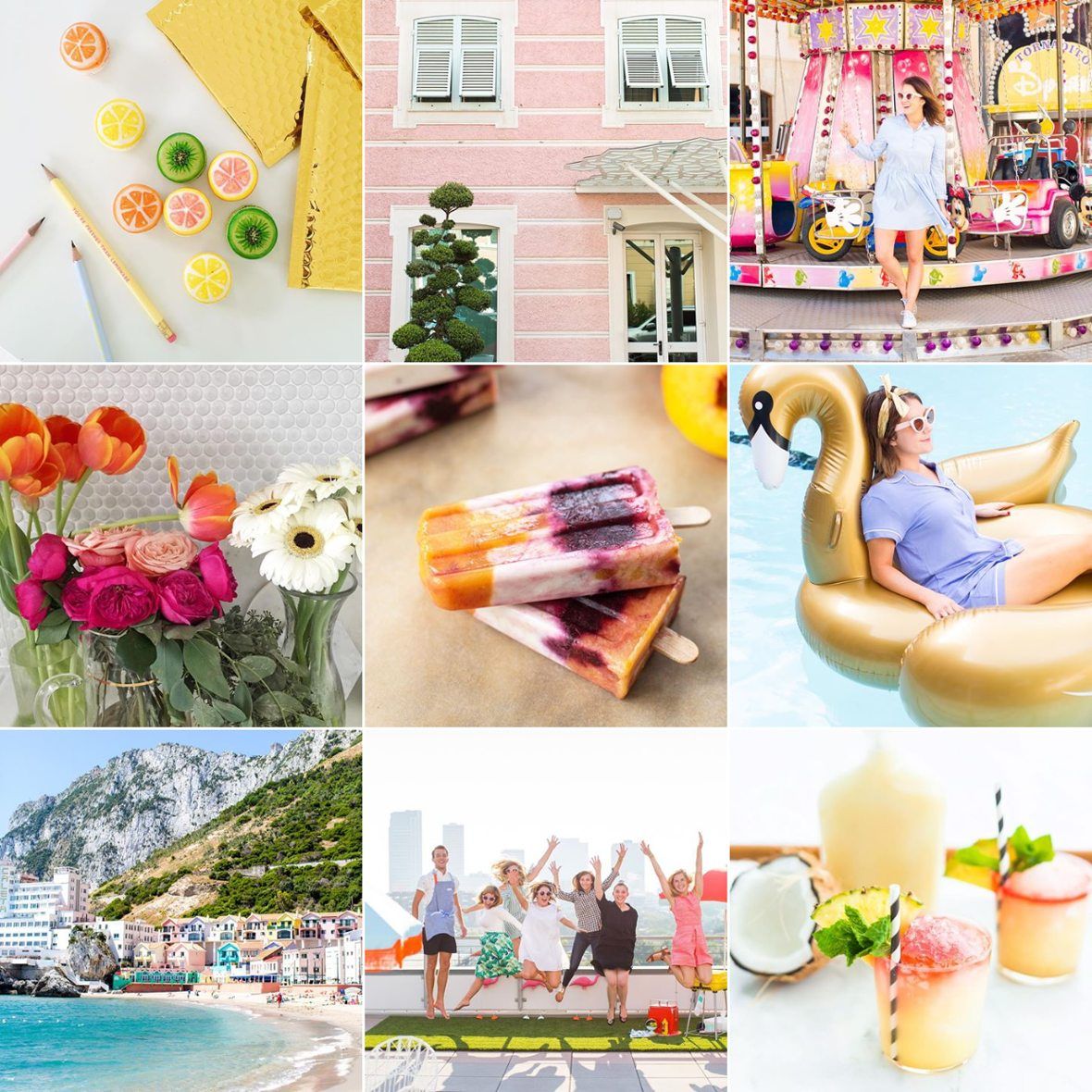
Sources start from top row (left to right).
source 1, source 2, source 3, source 4, source 5, source 6 We also recommend that you check out a few of your favorite Instagram accounts to gain some inspiration. See what colors the accounts you love are utilizing and take note of how their images transition throughout their feed.
Below are a few examples of Instagrammers who have chosen various themes to stick with on their grids and the results are just beautiful!
@meghanrienks keeps her Instagram feed clean by incorporating a lot of white and/or negative space, while also using different angles and photography composition. Each image transitions into the next seamlessly, which helps her feed "flow" beautifully, while maintaining a bright, fresh look.

Mary of @happilygrey brilliantly injects her feed with gray tones by saturating the images, while still maintaining a bold composition with high contrast. We love her feed's clean aesthetic. Mary allows subtle pops of blues and greens, as well as bold whites scattered throughout.

We adore @laurenconrad's feed with muted pastels, and tons of pink (#WeHaveThisThingWithPink)! She stays super consistent throughout and sticks with this same color scheme that stays true to her brand. The results are absolutely dreamy.

One of our favorite creative couples, Ashley and Jared of @sugarandcloth, does a fabulous job at making their feed bright and colorful in a tasteful way. They mix in all the colors of the rainbow to create pure Instagram perfection and their grid truly conveys their personal as well as their professional personalities and brand aesthetic. Keynotes to take away from their Instagram style is bright, crisp lighting! They usually shoot in natural lighting to keep their photography vibrant and consistent.
We adore Aleksandra Zee of @aleksandrazee! This gorgeous gal showcases her beautiful woodwork art on her Instagram, as well as other artsy shots of life and work. We love the way her feed has a golden hue to it. She uses a lot of neutral colors that give off a desert goddess vibe to her profile which speaks to her personal style and her handcrafted art. We are really digging it!

Utilizing your answers to the questions above, as well the Pinterest board you've created for your research (or the mood board you created) find the colors you're drawn to the most. We recommend that you stick to no more than 6 colors for your color palette.

Once you've created your color palette, evaluate your palette and decide whether it's a warm (reds, oranges, yellows, etc.) or cool-toned (greens, blues, whites, grays) color palette. This will assist you in selecting a filter that will be perfect to communicate your color story. Another way you can utilize your color palette is by utilizing the colors within your palette as background colors for graphics on your feed or Instagram stories.
Find a filter within your favorite photo editing application and select a filter that is either cool or warm-toned (depending on your color palette). This will be the filter you'll utilize to edit nearly all of your images (or you can utilize two filters that are similar to give your feed a little bit of variety).

One app we love for editing images is VSCO since they have a variety of filters to select from. We went ahead and selected some of our favorite cool toned and warm toned fillers for you to check out:
Warm Toned Filters | A6, A3, A10, C2, C6, C7 & E4 Cool Toned Filters | H5, H6, HB1, HB2, P4, & SE3
In order to successfully execute your new cohesive color story, it's important that you plan out your Instagram feed. If you're part of the PLANOLY fam, then you already know you can plan out your Instagram feed quite easily within our mobile app or web dashboard. When planning out your feed, you can ensure that your images pair nicely with one another color-wise - if they don't, simply reedit the image that looks a bit out of place. It might take some time for you find your cohesive color story, but we hope this post helps guide you in the process.
.svg)
Enjoyed reading it? Spread the word


